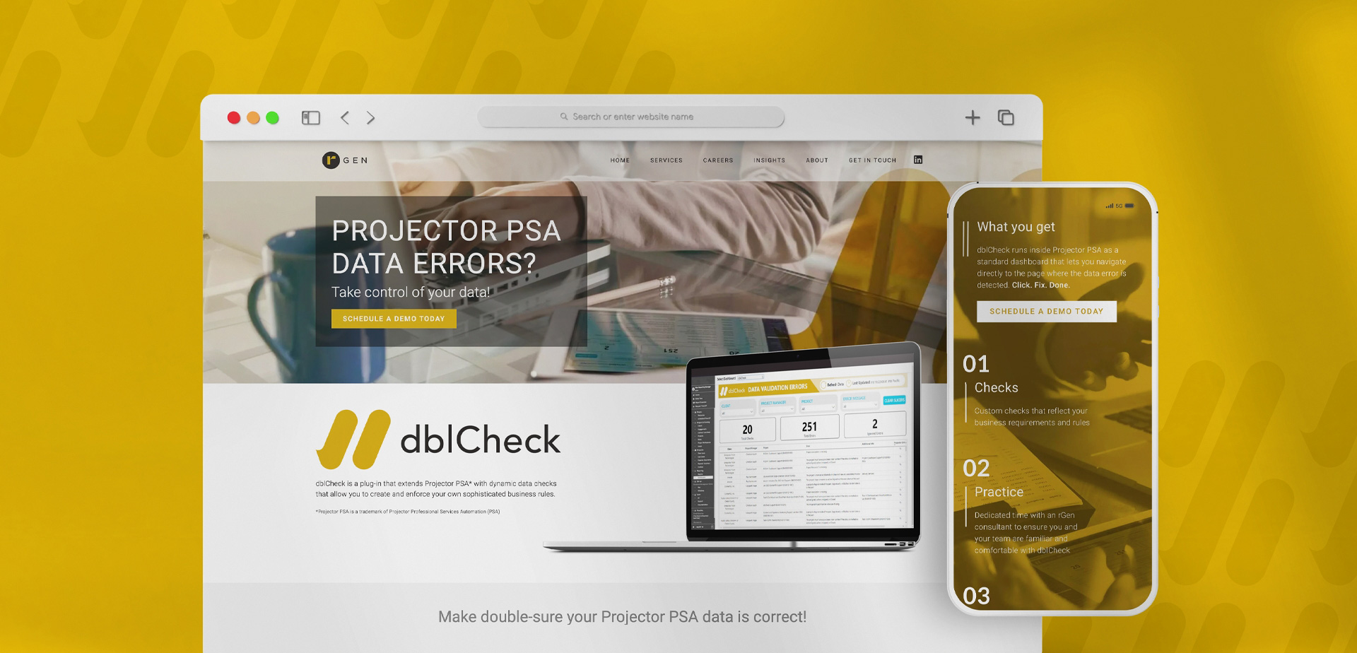
Brand identity for unparalleled data precision
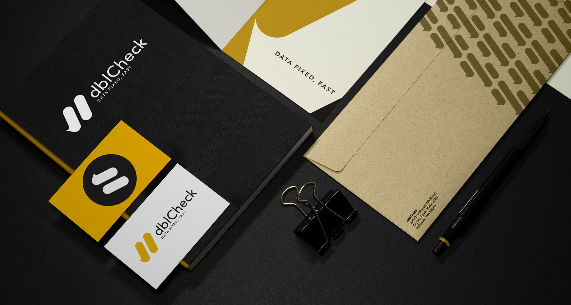
dblCheck
- Branding
- Custom Icon Design
- App Screens
In the swiftly changing tech landscape, rGen required a stand-out logo for their new application that embodied the product’s essence – a dedication to accurate, reliable data that builds user trust. The goal was to craft a captivating design that reflected these core principles while setting dblCheck apart as a prominent player in today’s data-driven world.
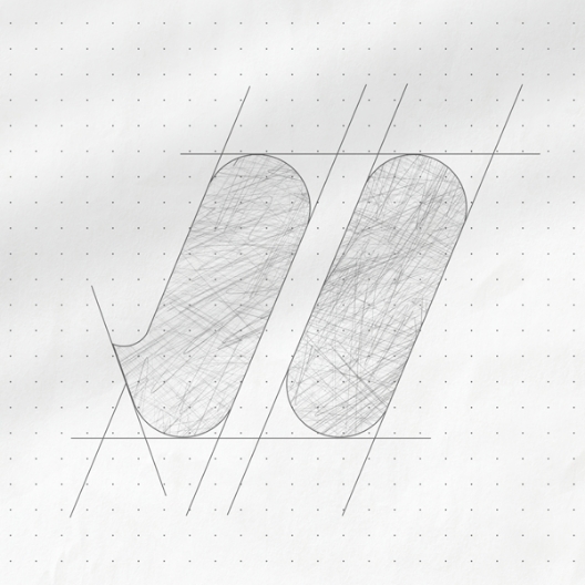
The Challenge
Our mission was to create an identity that embodied precision and reliability but felt modern and innovative. By blending the firm’s established brand with a contemporary visual language, we’ve shaped an identity that not only amplifies their credibility but also showcases their innovation.
The Solution
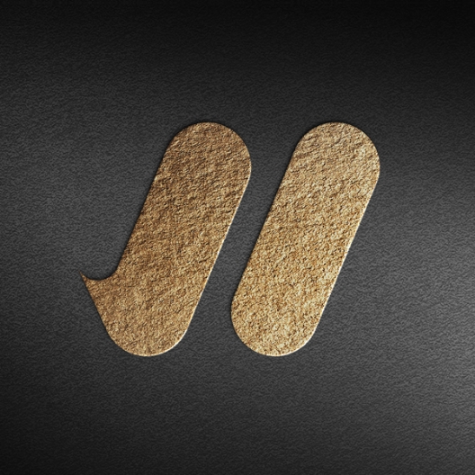
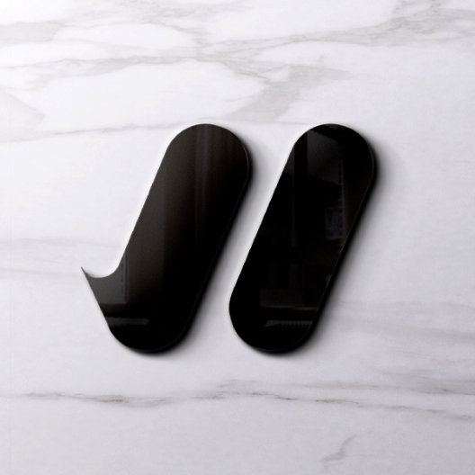
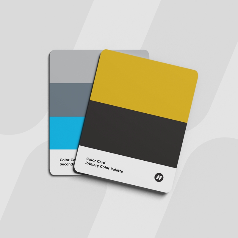
We set out to design the dblCheck app logo, incorporating the parent company’s color palette to create a unified visual language between the parent brand and its new product line. We crafted an exclusive double checkmark emblem, combining precision, purpose, modernity, and accessibility. This positions dblCheck firmly as a pioneer in data integrity, supported by a compelling and lasting visual identity.