Opening Doors: Transforming Homeownership with a Modern Brand Identity
Chenoa Fund
- Branding
- Trade Show
The Problem
Chenoa Fund, a program offered by CBC Mortgage Agency has been a vital resource for helping homebuyers achieve sustainable homeownership, supporting over 45,000 households nationwide since its founding. Despite its impactful programs, its outdated and inconsistent brand identity failed to reflect its modern perspectives and inclusive and progressive mission. Chenoa Fund needed a cohesive visual identity to communicate its purpose effectively across diverse audiences—lenders, realtors, and homebuyers—while building trust, inspiring confidence, and maintaining a welcoming, approachable presence.

Problem Solved!
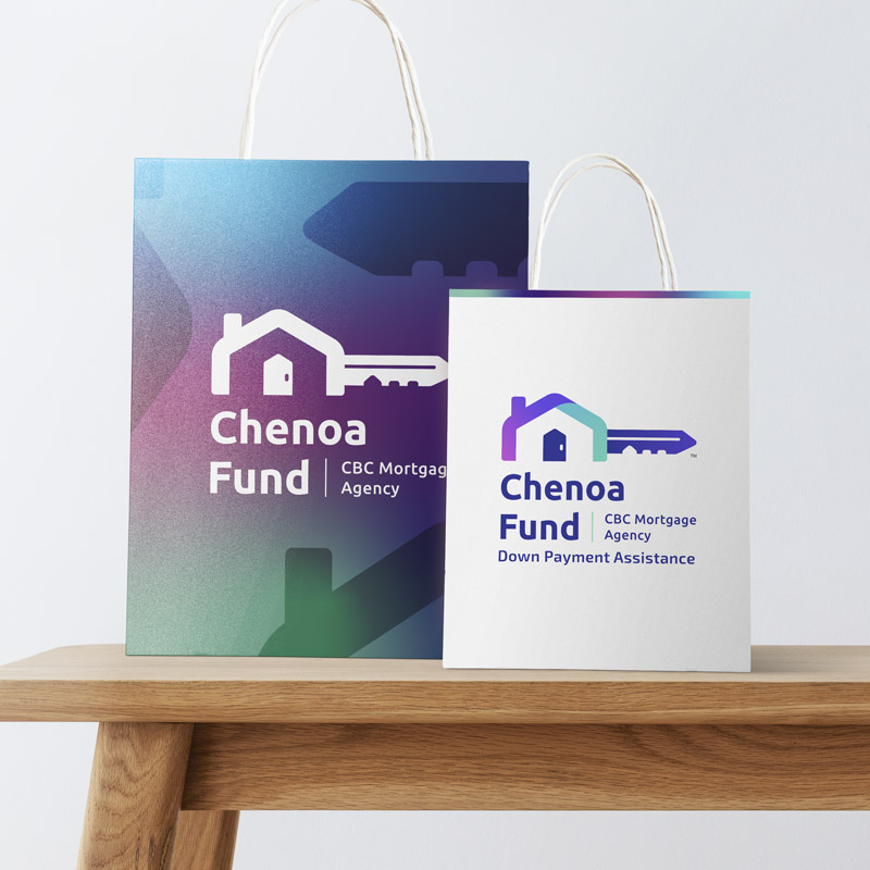
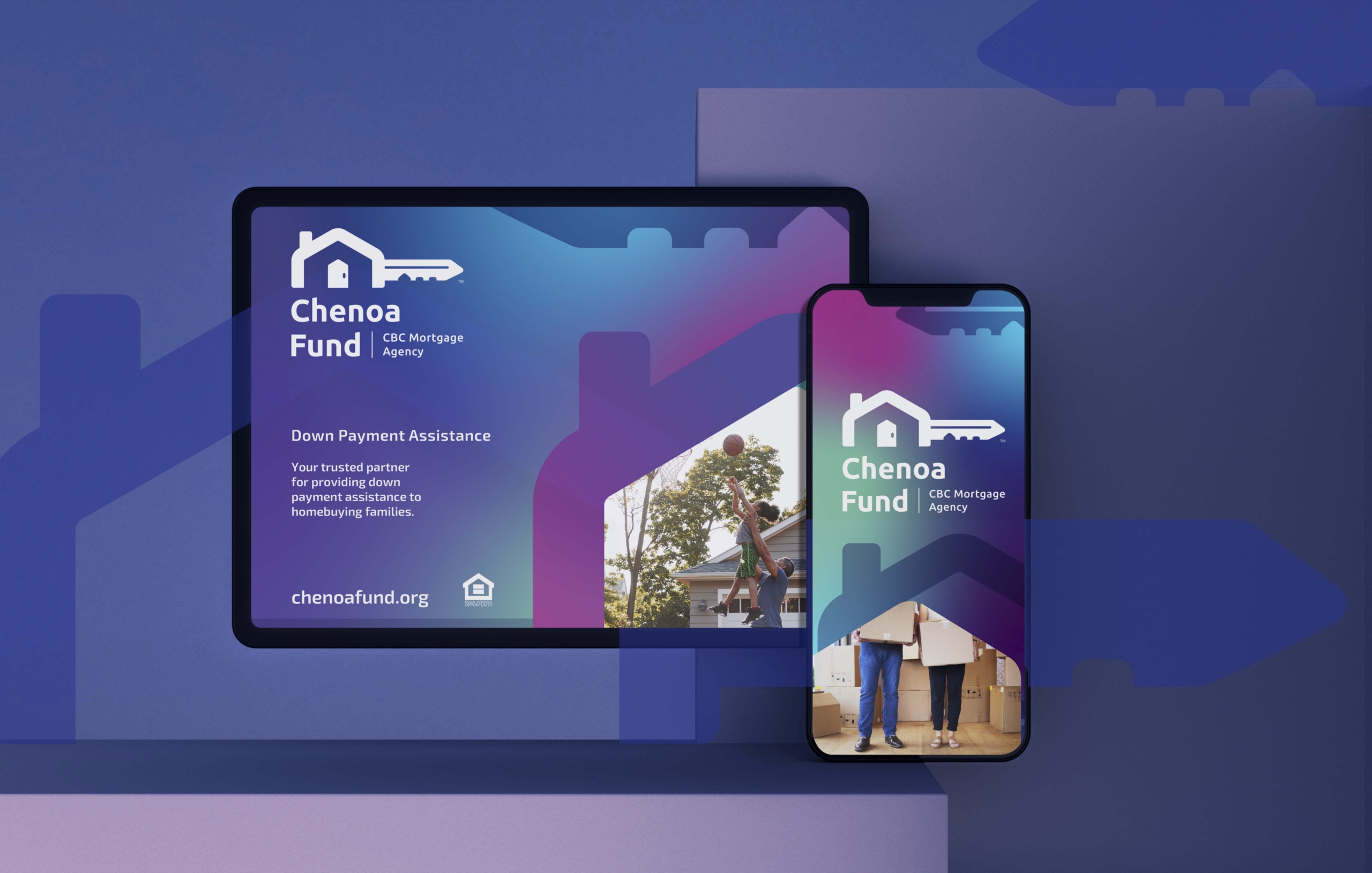
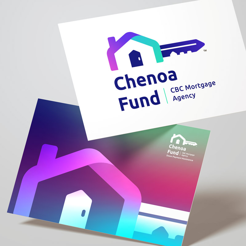
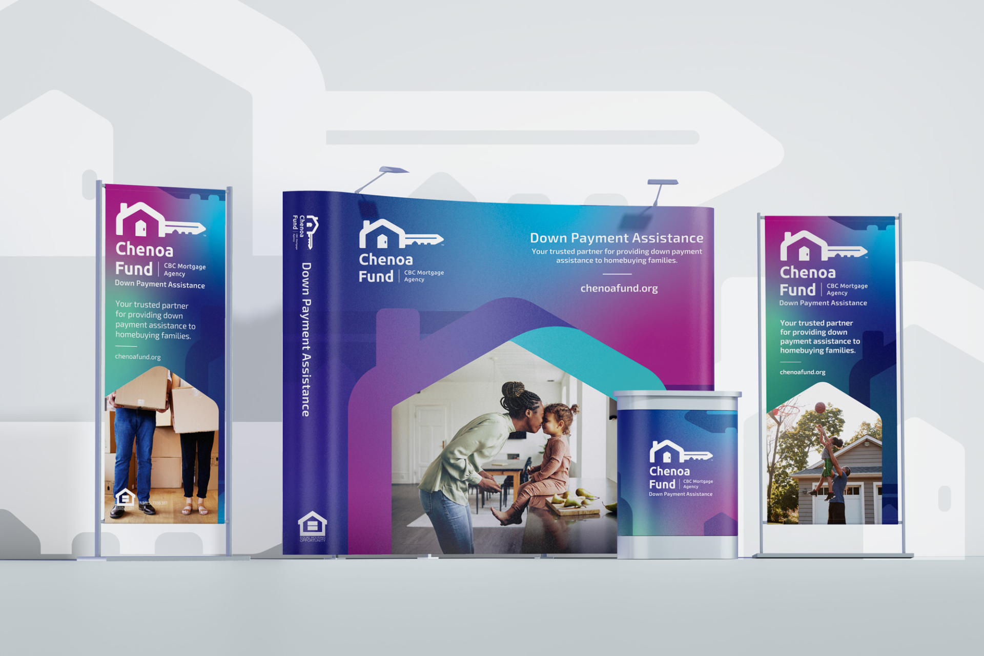
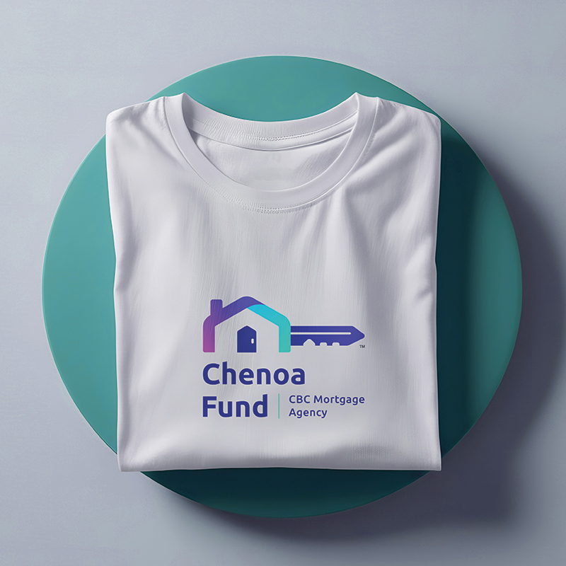
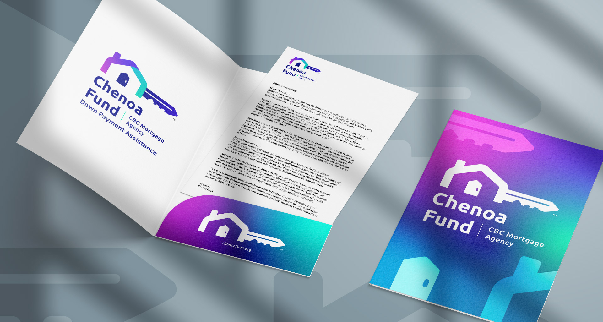
We developed a fresh, cohesive brand identity for Chenoa Fund that clarifies its purpose and eliminates confusion, effectively communicating its mission to empower new homebuyers. The design achieves a thoughtful balance between professionalism and approachability, with a modern logo that unites the program name, “Chenoa Fund,” with its parent company, “CBC Mortgage Agency.” Visual elements were thoughtfully integrated to highlight the brand’s focus on homeownership, while a strong yet friendly typeface with rounded corners reinforces CBC’s role as a trusted and supportive guide. Enhanced by a vibrant color palette softened with gradients, the refreshed identity emphasizes trust, inclusivity, and professionalism, establishing a distinctive and welcoming presence in the housing market.


Dramatic Results
The revamped brand identity helped to transform Chenoa Fund’s market presence, reinforcing its reputation as a trusted, modern, and inclusive partner in achieving homeownership. Featuring a thoughtfully designed logo and cohesive visual identity, the refreshed brand resonated with stakeholders and positioned Chenoa Fund as a recognized leader in the industry. By clearly conveying the organization’s mission and values, the new branding instills confidence in lenders and realtors while attracting a diverse range of homebuyers, empowering them to take their first steps toward homeownership.
