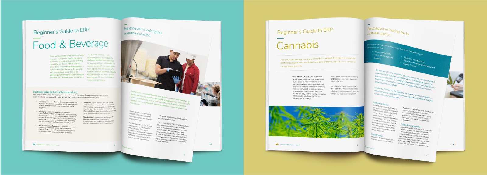
Bringing cohesion to food and cannabis
NexTec
- Branding
- Website Design
NexTec Group is a national consulting firm that helps mid-size businesses manage and integrate multiple information systems through technology. NexTec came to Electric Pen asking for brandmarks and website designs for two sub-brands, CannaBusiness Enterprise Resource Planning (ERP) and FoodBusiness ERP. The sub-brands needed to have unique independent visual identities and languages appropriate to the cannabis and food industries but harmonize with each other as part of the same family. The sub-brands would not use the NexTec name or logo but would have cohesion and a visual connection with it, should all three logos be seen together on marketing materials.
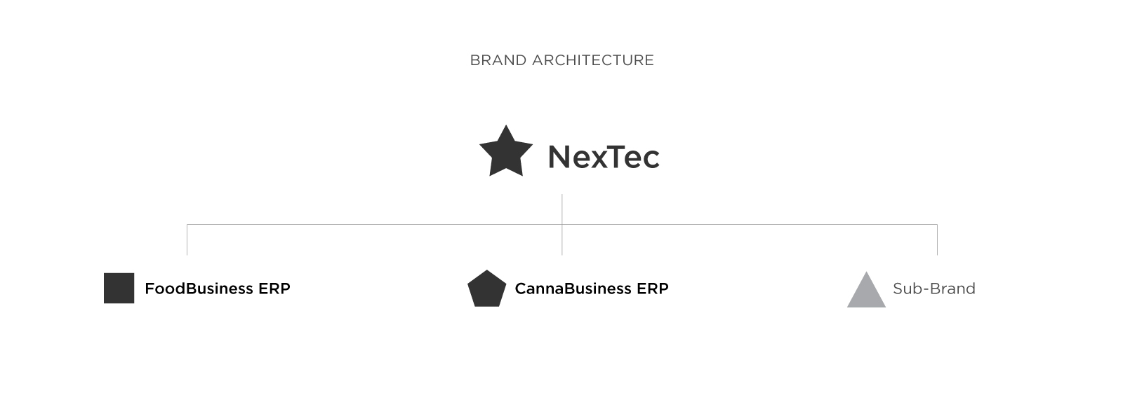
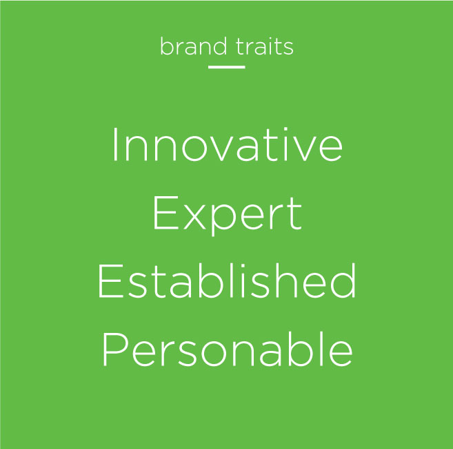
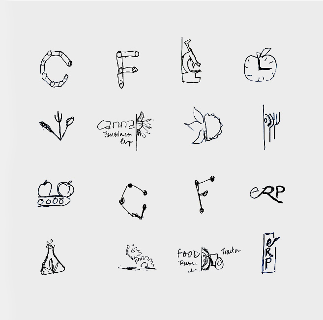
The unifying elements—the three leaves of CannaBusiness and three utensils of FoodBusiness—provided a universal lockup to tie the sub-brands together and create cohesion for future brands. With a complementary color palette, the marks were progressive, clean, and modern. Looking like established brands, they still felt boutique and personable—just what the client ordered.

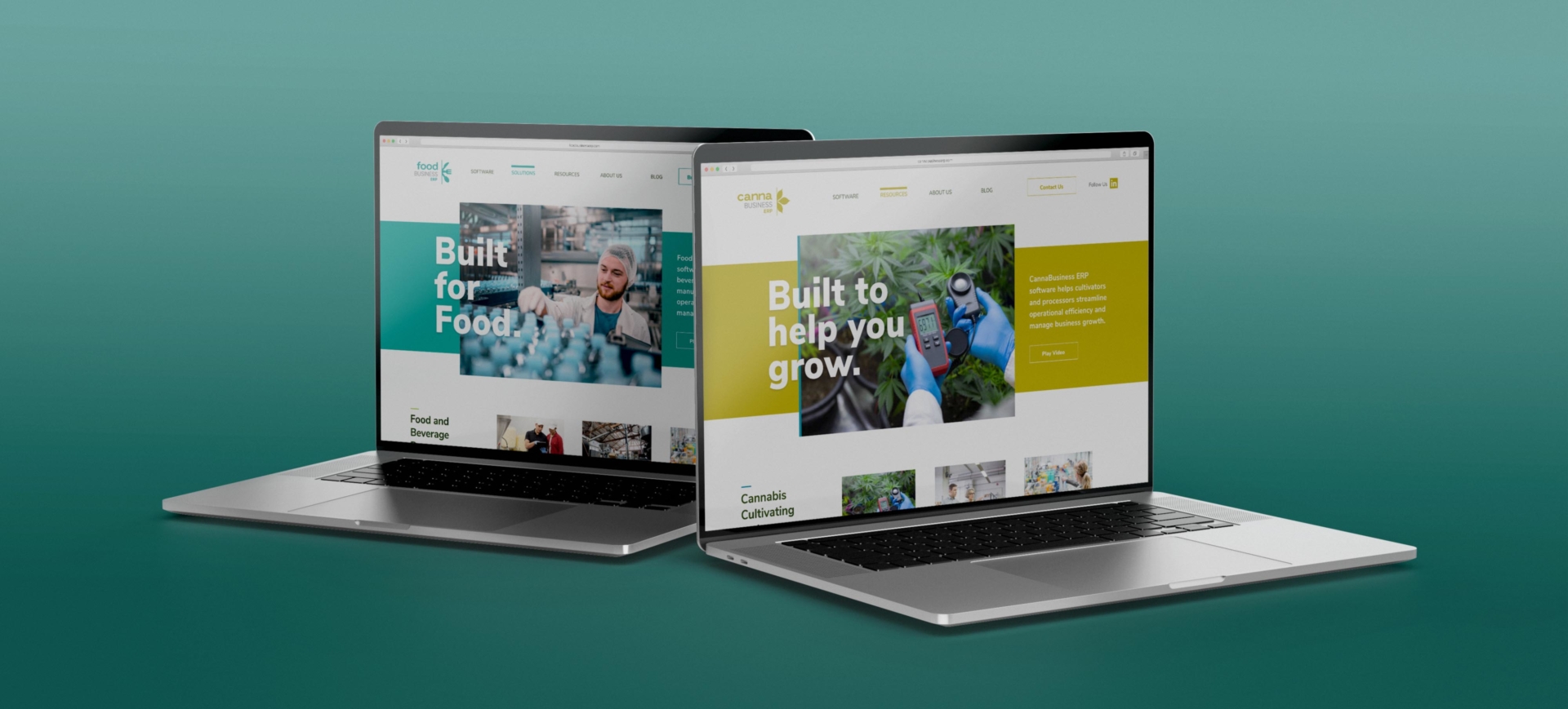
The brand system is flexible for ease of design across all NexTec’s communication channels. Consistent branding is key to eliminating confusion, earning customer advocacy, and building trust and transparency.

