Tackling a pest control problem
Paratex
- Marketing
- Branding
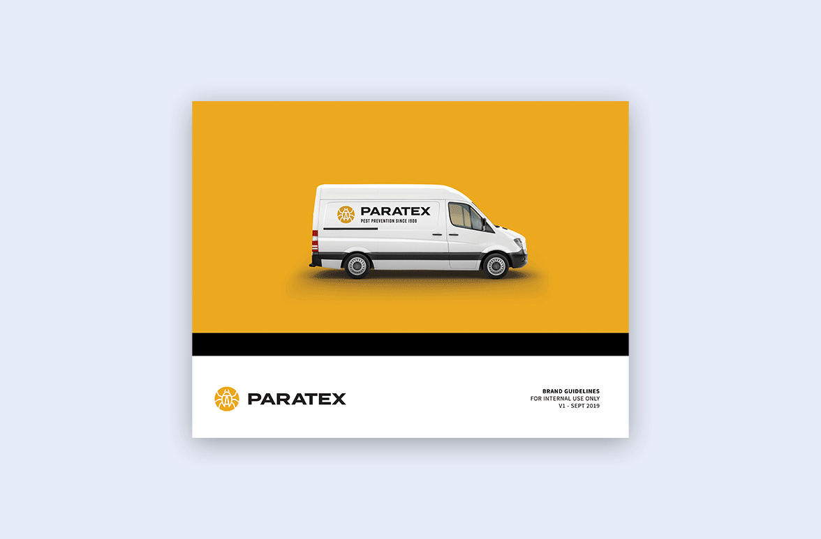
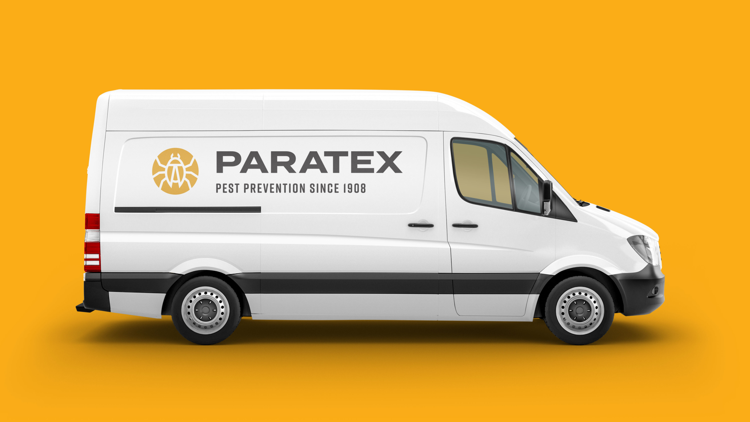
Paratex, a 100-year old pest prevention company, wanted to modernize its logo. The business valued its longevity and tradition but needed to portray a professional presence that better resonated with customers.
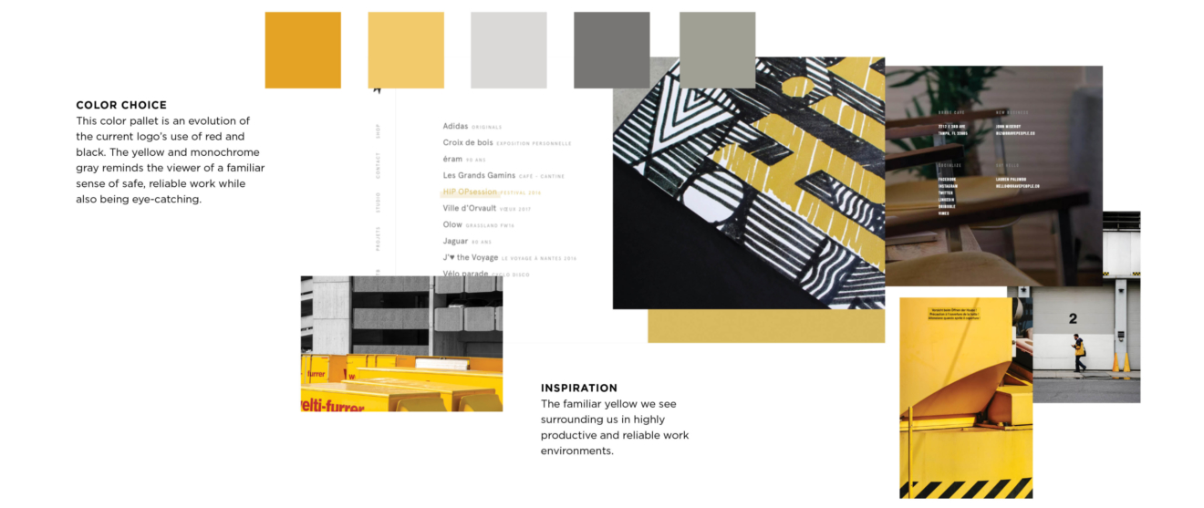
For the new logomark, we designed an abstract insect within a yellow circle, the color of caution. We landed on a font that was bold and contemporary, with the subtext a condensed contrast. Paratex placed the new logo on its company trucks—which served as large mobile billboards—and social media platforms.